A new look for Just for Kids Law
 The one thing everyone agrees on about the charity Just for Kids Law is that it punches above its weight. The user experience research came back as no surprise that the old website made the charity look much smaller than it actually is. It wasn’t clear how the different parts of Just for Kids Law came together.
This is the award-winning, ground-breaking, law-changing charity that transforms young people’s lives everyday. Its impact and reach was not being communicated by the old website. There was no clear statement about the charity. Viewers struggled to understand what it did, let alone how.
The charity had grown significantly in its 10 year history and had devised some seriously innovative strands of work. There was no coherent explanation of how these ‘sub brands’ all worked together to achieve the charity’s mission.
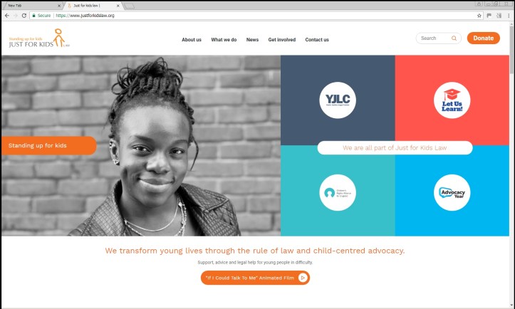
Brand architecture was a key consideration of the web redesign. Just for Kids Law is well established within the sector but the new ‘sub brands’ are less well known and have distinctive features with different brand values and tones of voice. We wanted to avoid a monolithic approach to the sub brands but to leverage the recognition and credibility of the Just for Kids Law brand.
The idea of the grid worked well – simply showing the logos/logo types of the sub brands in a clear and concise way. This has been one of the major achievements of the new site. It came about following a chance meeting on the bus one morning after school drop off with another parent who is head of digital at a major international agency. The kind parent even sent me some suggested solutions whilst on a business trip in the states – having completely understood the issues around brands / sub brands, extrapolating their knowledge from global consumer brands.
Following a cup of coffee with the corporate communications expert writer, Rebecca Dowman, of Content Consulting, we had a punchy strap line so people understood what the charity did at a glance. Rebecca also edited some copy for key sections of the site pro bono having been impressed by the work of the charity.
When I was redrawing the site map I cut out a lot of repetition and cut down the top line navigation. The previous site had evolved – the new site was designed.
As Comms and campaigns director my focus was very much on the messaging, the tone, the look and feel of the website and identifying and responding to the key audiences. The website as ‘shopfront’. Being part of a small comms team with virtually no budget and no IT support the most challenging part was having to understand SEO. There was a slight panic a week before launch when trying to track down the DNS (Domain Name Servers) details / passwords. I also had to find out more than I really wanted to know about diverting URLS etc. If I was starting again I would have built in more time for this aspect of the work and taken some advice about wordpress SEO plugins.
Being in a small charity there was never enough time each week to dedicate to the project. As a result it dragged on which no doubt lead to some frustration with the external web team. I am not sure much can be done about this – it’s a fact of life for small charities.
During my career I have worked on three website projects. The same issue cropped up twice where the person who seals the deal with you from the web design company doesn’t actually have much to do with you once terms have been agreed. I was very clear that I was on a fixed budget and there would be no more money under any circumstances. It’s really important to ensure that message is communicated to the team actually doing the work. Having worked agency side I understand the pressure teams are under to ‘up sell’. Clarity from the outset about scope and budget with everyone involved can avoid frustrations on both sides.
Main reasons for redesigning the Just for Kids Law Site:
- Poor navigation
- No clear brand architecture (relationship between sub brands was incoherent)
- No clear statement about the role of the charity
- No investment in the site – which has evolved over time without strategic thought
- The site was clunky – some sections couldn’t be changed without coding knowledge
- The site was not properly responsive
- The site was not integrated with our social media platforms
- The content was repetitive and outdated
- The charity has had major achievements changing the law; changing policy and attitudes. The website didn’t reflect that at all. The charity looked smaller – underselling its huge impact.
Key objectives of redesign
- Need to know at a glance what the charity does
- Need to show at a glance what impact we have
- Need to make it easy for people to donate
- Need to know sub brands are part of Just for Kids Law
- We needed to segment campaigns with a campaign template (so we could promote direct urls)
- Need site to be properly responsive
- Make content easier for social sharing
- We needed to have a flexible CMS so it is easy to upload content in house, and to ensure back end technology is maximised such as SEO/ google analytics.
You can visit the site here
